css制作旋转幻影
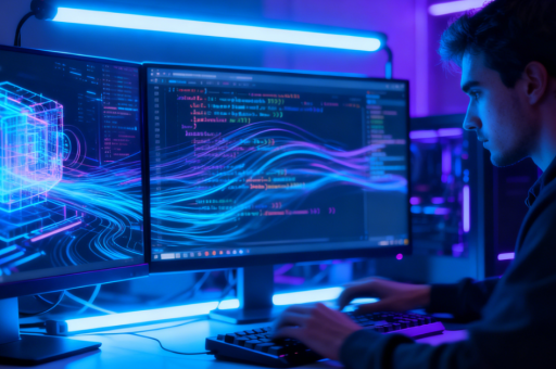
CSS旋转幻影效果实现
旋转幻影效果通常通过CSS动画和多重阴影/伪元素实现,以下提供两种常见方法:
方法一:使用box-shadow和动画
通过旋转元素并叠加多层阴影创造幻影效果:

.phantom {
  width: 100px;
  height: 100px;
  background: rgba(255, 0, 0, 0.7);
  border-radius: 50%;
  position: relative;
  animation: rotate 3s linear infinite;
  box-shadow:
    0 0 10px 5px rgba(255, 0, 0, 0.4),
    0 0 20px 10px rgba(255, 0, 0, 0.3),
    0 0 30px 15px rgba(255, 0, 0, 0.2);
}

@keyframes rotate {
  from { transform: rotate(0deg); }
  to { transform: rotate(360deg); }
}
方法二:伪元素叠加
利用伪元素创建延迟动画的副本:

.ghost {
  width: 80px;
  height: 80px;
  background: rgba(0, 150, 255, 0.8);
  border-radius: 10px;
  position: relative;
  animation: spin 2s ease-in-out infinite;
}

.ghost::before, .ghost::after {
  content: '';
  position: absolute;
  width: 100%;
  height: 100%;
  background: inherit;
  border-radius: inherit;
  opacity: 0.6;
  animation: inherit;
}

.ghost::before {
  animation-delay: 0.3s;
}

.ghost::after {
  animation-delay: 0.6s;
}

@keyframes spin {
  0% { transform: rotate(0deg) scale(1); }
  50% { transform: rotate(180deg) scale(1.2); }
  100% { transform: rotate(360deg) scale(1); }
}
进阶技巧
- 混合模式增强效果:添加
mix-blend-mode: screen;使重叠部分更亮 - 滤镜效果:使用
filter: blur(2px);创造柔和边缘 - 3D旋转:改用
rotate3d()增加立体感 - 颜色渐变:在动画中插入
background的颜色变化
示例组合效果:
.advanced {
  width: 120px;
  height: 120px;
  background: linear-gradient(45deg, #ff00cc, #3333ff);
  border-radius: 50%;
  animation:
    rotate3d 4s ease infinite,
    pulse 2s ease infinite alternate;
  filter: blur(1px);
  mix-blend-mode: screen;
}

@keyframes rotate3d {
  0% { transform: rotate3d(1, 1, 0, 0deg); }
  100% { transform: rotate3d(1, 1, 0, 360deg); }
}

@keyframes pulse {
  from { opacity: 0.7; }
  to { opacity: 1; }
}
这些效果可以应用于按钮、加载动画或视觉装饰元素。通过调整动画时间、延迟和颜色值可获得不同风格的幻影效果。